Wednesday, December 8, 2010
Link for open project and playhouse website
www.appstate.edu/~cc76230....there is a link for the children's playhouse on my homepage!
Thursday, December 2, 2010
Tuesday, November 30, 2010
Monday, November 29, 2010
Sunday, November 28, 2010
Sunday, November 21, 2010
Friday, November 12, 2010
Poster
one more direction:

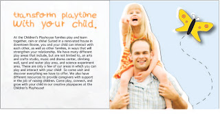
Two directions for my poster. The top one has a small white border around the entire poster and is heavier at the bottom where the text is.
Tuesday, November 2, 2010
Monday, November 1, 2010
Tuesday, October 19, 2010
Wednesday, October 13, 2010
Monday, October 11, 2010
Sunday, October 3, 2010
Wednesday, September 29, 2010
Wednesday, September 22, 2010
Design Goals and Strategy
Goals:
- To brand The Children's Playhouse with a more professional look, while still maintaining playful and inviting elements.
- Brand the Children's Art of the High Country poster with the same style as the Children's Playhouse so that the audience can be informed of the event, while still being able to obtain more information about the Children's Playhouse
- Since the Children's Playhouse is losing some funding, I need to emphasize the value of attending and engaging in activities there so it will appeal to potential donors.
- I will play with fun and unexpected elements that may appeal more to children, but I will combine them with a clean, simple, professional design.
- I will promote the Children's Art of the High Country exhibition, but I will make sure to let the audience know that The Children's Playhouse is coordinating the event.
- I think that adding a more professional look will accomplish this so that people will take it seriously. Also, incorporating the benefits of attending The Children's Playhouse will help potential donors see the value within the company.
Tuesday, September 21, 2010
Subscribe to:
Comments (Atom)


